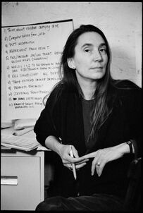
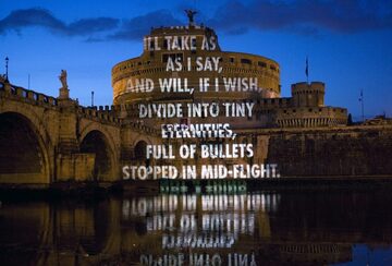
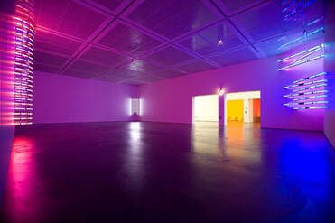
 Jenny Holzer is an American contemporary artist who works primarily with textual art pieces. She studied art at Duke University and at the University of Chicago. While enrolled in the Rhode Island School of Design, Holzer started working with textual art pieces. Holzer says she likes working with textual art because she “wanted to offer content that people- not necessarily art people- could understand.” Her most well-known series of works is the Truisms series which she created in 1977. It consists of one line proclamations such as “money creates taste” and she posted these all over New York. Holzer uses shirts, projections, and poster to carry text that conveys her ideas of language both for communication and for control. I really enjoy the simplicity of her artwork and that her work is still able to convey powerful images to a wider audience. I love that her projection work is changed by the form of the building she projects her text on. It sometimes warps the words and adds to her strong messages. This effect can be seen in her work For the Academy. Additionally, Holzer is able to create a unique atmosphere for her textual messages by her use of LEDs in her MONUMENT series. I feel like all of her work opens a forum for people to understand and discuss her art. I want to replicate this idea in my work, attempting to apply my art to a wider audience. Whether this is through textual art pieces such as Holzer’s or through a different perhaps simplified method.
This past week I was able to work with my Bruni underpainting further. Most significantly, I was able to finally adjust the angle of the top of the book as pictured below to a less severe a more accurate angle. I am glad I finally was able to achieve this angle had given me a hard time for the past few classes. By squinting at my still life I saw that the edges of the teapot and book really bleed into the dark background, so I achieved the feeling of space by darkening the edges of the book and teapot as seen in picture four below. The still life felt more realistic and grounded after this addition. The next class I added some finishing touches of raw umber to the underpainting, making sure to fix any patchy areas in the background or on the book. I also had a lot of fun adding some highlights. I found that the titanium white paint was very bright and concentrated so it was important to use a significant amount of terpenoid to tone down the brightness when applying the thin layers of white. I used the white to fix some of the areas I painted too dark and also applied the reflections and bright highlights present on the ceramic teapot. The highlights definitely brought the painting to another level of realism really creating the illusion of form on the teapot. I am excited to finish up my underpainting and start applying thin layers of color next class! |
Emma LindleyHi! I am an art student at Maggie Walker and I am so excited to share with you my thoughts, my art ideas, and my finished works. I hope you enjoy! Archives
June 2021
|
 RSS Feed
