|
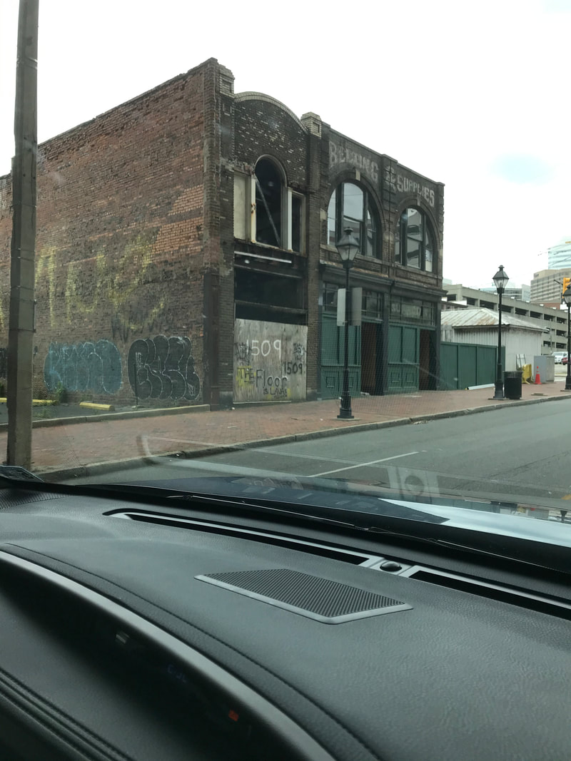
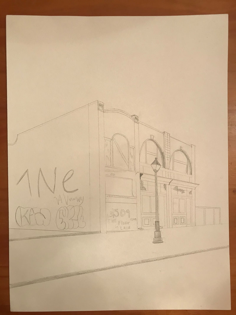
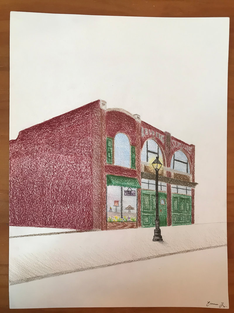
For my second "head" project I again portrayed the theme of adaptive reuse. I drove through Richmond and found this run-down abandoned building. I had a vision for what it could be renovated to be and drew a pencil picture of the state in was in and went over in colored pencil and drafted my vision for a little bakery. The beauty of adaptive reuse is you can make a space functional for the present-day, while still keeping the character of the original building.
0 Comments
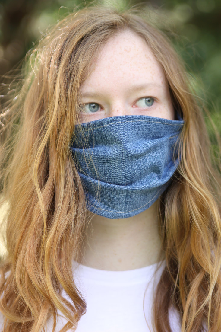
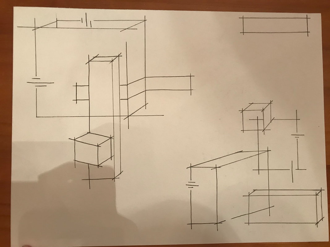
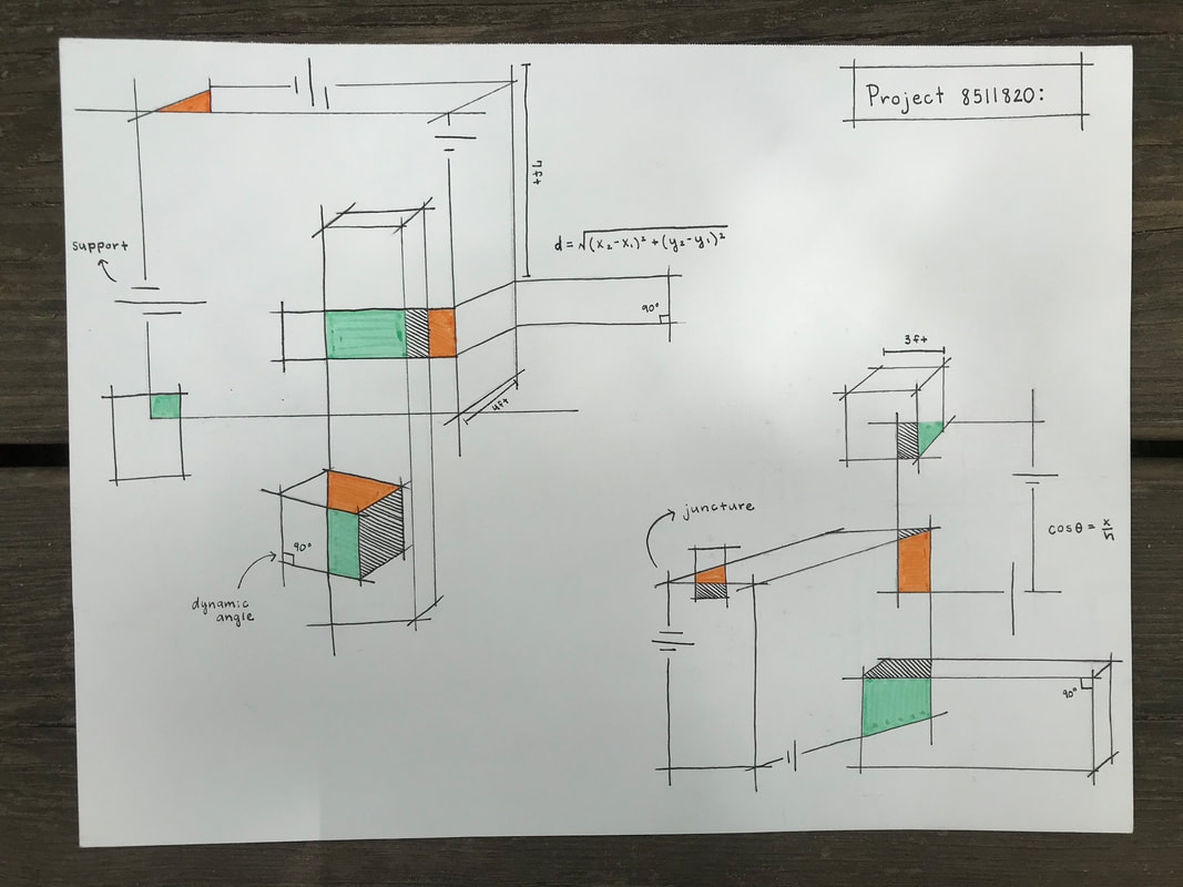
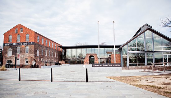
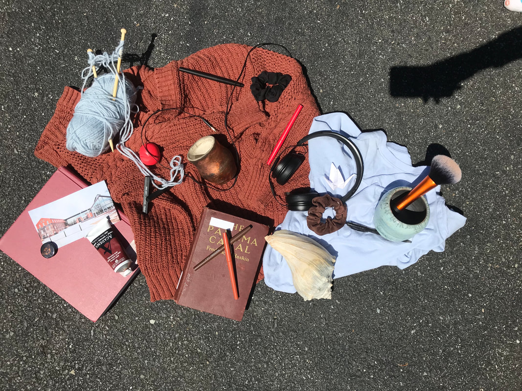
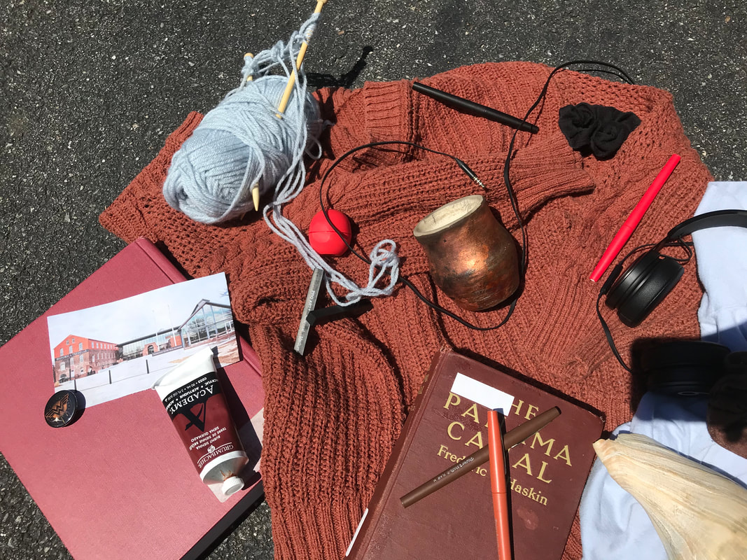
This was the first of my "head" projects. My idea for the head projects was the concept of adaptive re-use: taking a pre-existing object and adapting it for current use. I took things in my house that I did not use anymore in this quarantine and made them into masks. This piece highlights the adaptability of society and how we were able to function in this new world. Additionally, the materials I reused represent different aspects of my life that were cancelled or affected by this pandemic. A mask made of a shimmering fabric and running shoe laces for prom and track, a mask of an old church t-shirt for church and my choir trip, a mask of jean material for school, a mask of an old washcloth for childhood, a mask of a takeout bag for eating out, a mask of a bandana for Girl Scout camp. Pictured below are the six masks in a grid and the jean mask on me. This was my second heart project were I continued to work in the process of abstraction. This time I decided to abstract different overlapping architectural forms by using intersecting lines. I also used formulas and key terms to show the math and consideration that also goes into architectural planning. I decided to use micron pens and markers in sleek lines to indicate professionalism. I decided to name this project with a cryptic number to emphasize the concept of abstraction, the number indicates that this drawing could correspond to many different architectural projects. In this case the number spells out heart, in honor of the assignment. Shown below is a process picture and the final result. This was my first "Heart" project and I decided to work in the artistic process of abstraction. I took the renovated Historic Tredegar American Civil War Museum and I abstracted it into a collage based on its colors. I chose this building because its an important Richmond landmark and I have a lot of memories associated with it, from folk festivals to museum trips with my mom. 1. HEAD. An idea of adaptive re-use has emerged from my explorations. The idea of taking something that has been abandoned or neglected and adapting it for present use. I want to portray one art work as a layering of an abandoned structure and the structure reimagined on top. I do not know what my other head piece will look like yet, but it will also be based off of this theme.
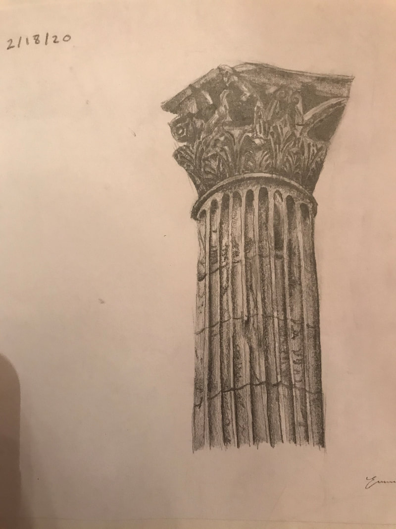
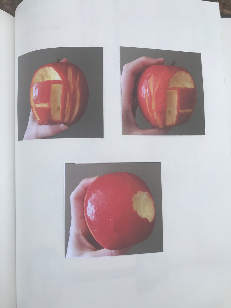
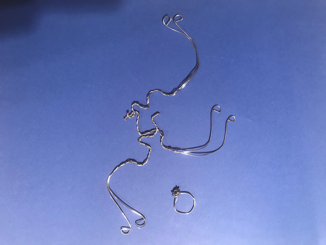
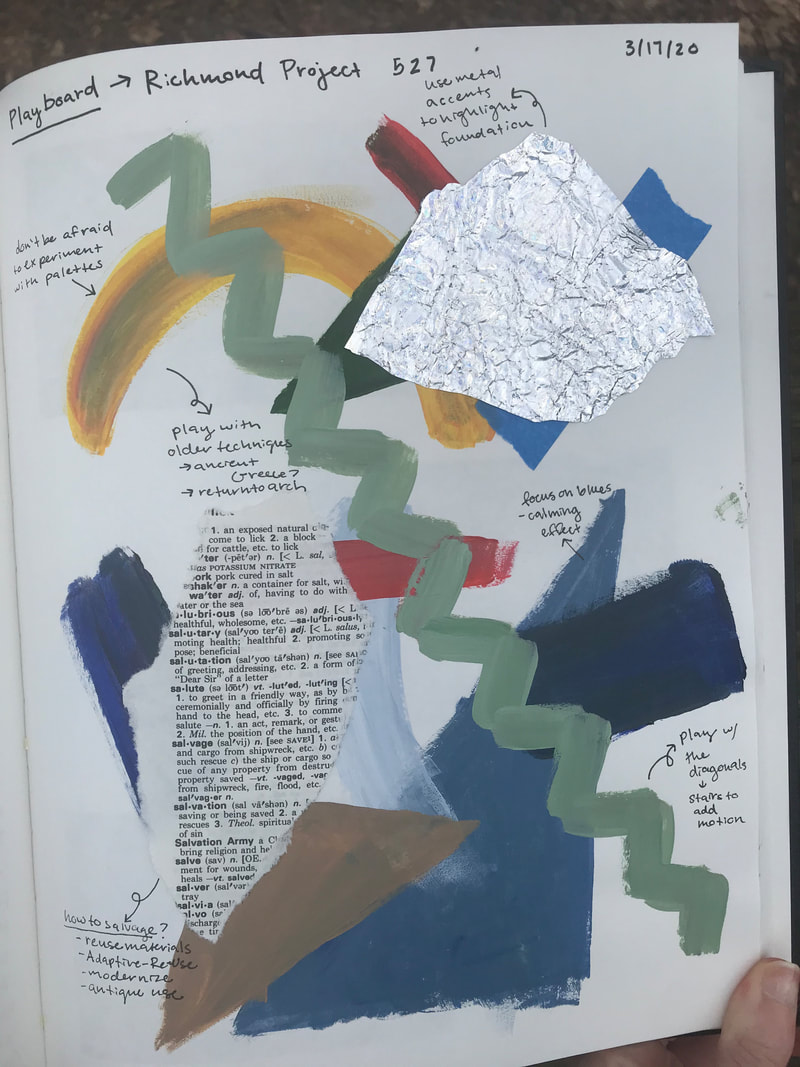
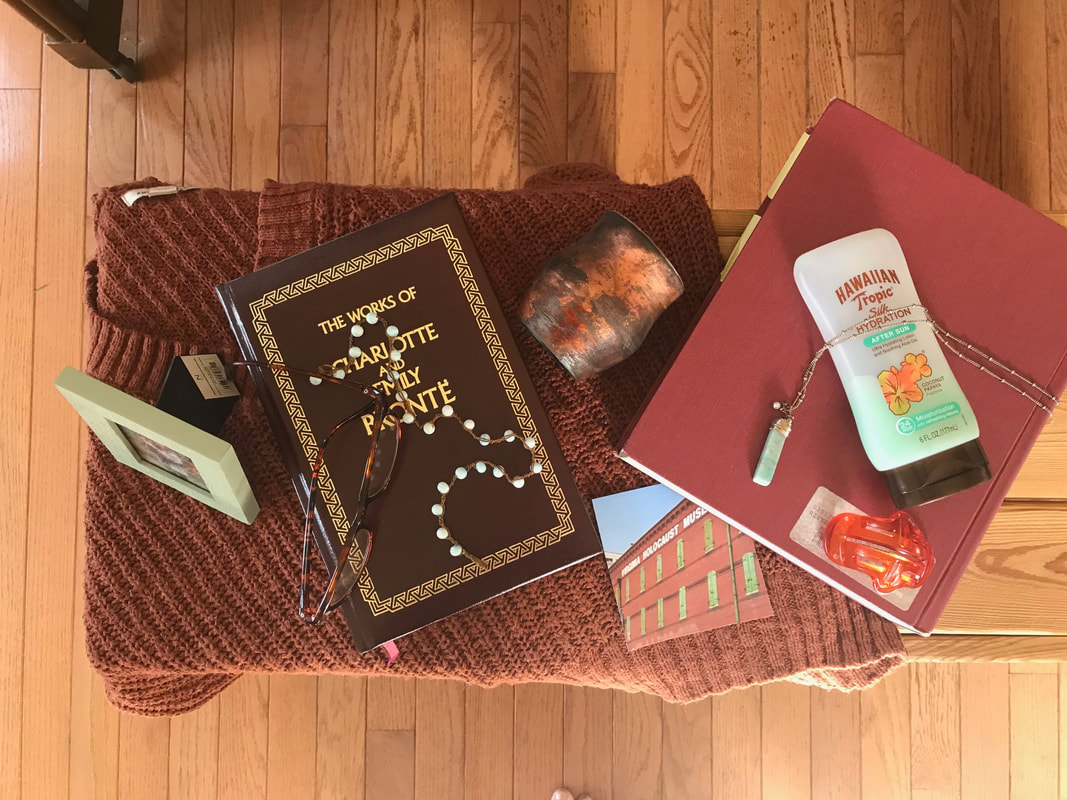
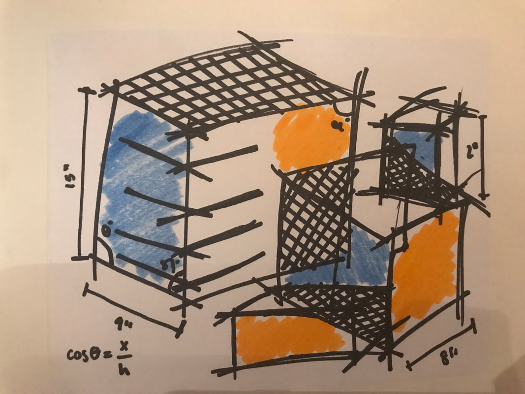
2. HEART. One artistic process that I practiced often in my play pages was abstraction. Taking an architectural form or simply the profession of architecture and abstracting it. For example, I did this in my playboard play page. I also worked abstractly and made pages out of repeating lines and angles, focusing on the geometry of architecture. So I want to create one piece that abstracts an architectural form, like a building, in 3D by compiling objects from around my house. I also want to create a piece that focuses on abstracting architecture using lines and angles and formulas. I did something similar to this, but now I want to do it on a larger scale. Over the last several weeks, I was playing with the idea of architecture. Crafting relatively quick projects to generate ideas of all the different ways to present this concept. The most common depiction of architecture that I created was an abstract one. Thinking about architecture differently than just its visual form, although I did have fun creating a couple more realistic images of my favorite landmarks. One idea that emerged in several of my pages was the one of abandonment and along with that concept one of adaptive re-use. This is a fascinating architectural and artistic concept, because you have the opportunity to revitalize art for the present day. Another idea that appeared for my pages was juxtaposition of subject matter and materials/ processes. For example, I drew an image of a run-down gas station realistically with pencil, a more formal art process along with a low-profile subject or when constructed an abstraction of the holocaust museum’s exterior with household items. Throughout these last few weeks, I found that I really enjoyed drawing with ink pens and creating collage. I love the aesthetic of dark ink on the drawing surface. Additionally, I found myself really enjoying making different collages, whether 2D or 3D, it was an engaging process because you can work through many different artistic forms and involves deep thinking. Looking back at all of my pages, I find a heavy use of lines, which makes sense because I am drawn to architecture. The pages that were the least successful for me were the page were I carved out of an apple and formed wire. I just was not able to work with these two mediums, I became very frustrated with the process. The pages I think were particularly successful were the realistic pencil drawing of a Greek column because I was able to render it very well. Additionally, the Playboard: Richmond Project collage was successful because of the content: a focus on salvaging and revitalizing spaces and also the process of collage aided the content nicely. Lastly, the work in 3D where I abstracted the façade of the Richmond Holocaust Museum and portrayed it in household items. I felt like this process was fun and creative and I think it would make for an interesting series where I abstract many different architectural landmarks.
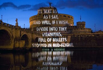
 Jenny Holzer is an American contemporary artist who works primarily with textual art pieces. She studied art at Duke University and at the University of Chicago. While enrolled in the Rhode Island School of Design, Holzer started working with textual art pieces. Holzer says she likes working with textual art because she “wanted to offer content that people- not necessarily art people- could understand.” Her most well-known series of works is the Truisms series which she created in 1977. It consists of one line proclamations such as “money creates taste” and she posted these all over New York. Holzer uses shirts, projections, and poster to carry text that conveys her ideas of language both for communication and for control. I really enjoy the simplicity of her artwork and that her work is still able to convey powerful images to a wider audience. I love that her projection work is changed by the form of the building she projects her text on. It sometimes warps the words and adds to her strong messages. This effect can be seen in her work For the Academy. Additionally, Holzer is able to create a unique atmosphere for her textual messages by her use of LEDs in her MONUMENT series. I feel like all of her work opens a forum for people to understand and discuss her art. I want to replicate this idea in my work, attempting to apply my art to a wider audience. Whether this is through textual art pieces such as Holzer’s or through a different perhaps simplified method.
This past week I was able to work with my Bruni underpainting further. Most significantly, I was able to finally adjust the angle of the top of the book as pictured below to a less severe a more accurate angle. I am glad I finally was able to achieve this angle had given me a hard time for the past few classes. By squinting at my still life I saw that the edges of the teapot and book really bleed into the dark background, so I achieved the feeling of space by darkening the edges of the book and teapot as seen in picture four below. The still life felt more realistic and grounded after this addition. The next class I added some finishing touches of raw umber to the underpainting, making sure to fix any patchy areas in the background or on the book. I also had a lot of fun adding some highlights. I found that the titanium white paint was very bright and concentrated so it was important to use a significant amount of terpenoid to tone down the brightness when applying the thin layers of white. I used the white to fix some of the areas I painted too dark and also applied the reflections and bright highlights present on the ceramic teapot. The highlights definitely brought the painting to another level of realism really creating the illusion of form on the teapot. I am excited to finish up my underpainting and start applying thin layers of color next class! |
Emma LindleyHi! I am an art student at Maggie Walker and I am so excited to share with you my thoughts, my art ideas, and my finished works. I hope you enjoy! Archives
June 2021
|

 RSS Feed
